Contemporáneos
Book Series
For this series that began to circulate as pocket books initially, continuity in design is established not so much through format and other technical qualities, but through the treatment of the authors’ last names on the spines as they line up on the shelf. The fore-edges are colored, and the typographical compositions of the covers, each of which features a quote from the book, connect in an exponential “zoom-in” effect that develops from one volume to the next.
Fonts used were Trade Gothic and Minion Pro. In place of the usual black ink, one Pantone color was used for each book in the series, making it cost-effective for offset printing, but with a visually appealing finish


Ideas for a cover or series?
Other
Projects
Poemas - Experimental BookPoetry by Ida Gramcko
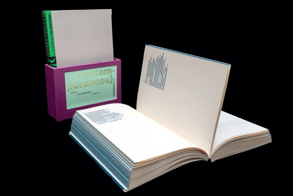
Read More
Photobook: The Private Life of Rag DollsTexts by Aquiles Nazoa. Photos by Godofredo Romero and Samoel González
Read MoreExhibition design at Miriam Gallery
Read MoreResearch, design, and prepress
Read More